Anyway, after much tinkering and nail chewing, I came up with this new piece. On the whole I'm pretty pleased with it. Though of course every time I look at it I still immediately nitpick it's flaws. (i'm such a typical artist-slash-perfectionist!)
People are always writing to me and asking how I do my photoshop tricks. So I thought it might be fun to post a blog taking you through the process step by step. (minus the cursing and keyboard banging)
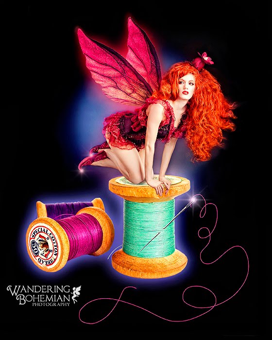
Ok, so here's the completed new piece. Pretty snazzy huh? ;)
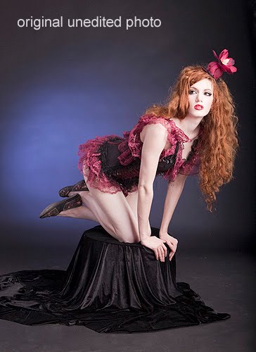
And here we have the original, unedited photo. Shot at Serena's home studio, this was 1 of several sets that we did that day. Many times people will ask me how I choose which one will become the final artwork. Honestly, I really can't answer that. I mean, there's the basics that you always look for - evenly lit (for photoshop work of this kind I need it to be well lit), good pose with no limbs looking like they've been amputated, good facial expression, etc. But I had tons of shots that fit those qualifications. Most of the time I just go by gut. This was one of the images that jumped out at me where I thought, "Hey . . . I could do something really neat with that one, I'll bet." (which incidentally is how I met my fiance, he he)
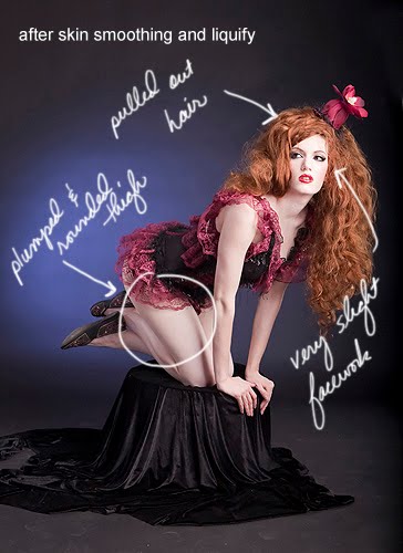
 Ok, so I have my image opened up in CS4. I use a Wacom tablet, as it allows me to be able to draw and paint, which is what I'm geared for with my fine arts background. The first thing I do is skin smooth and do any facial retouching. Serena has pretty great skin already, so I didn't need to do any blemish or under-eye or jowl retouching. (yes, I do all of that often) I also didn't need to hand skin smooth, I only do that for the headshots and close ups. It's a process that takes about 15 min's usually, but this is not a close up and she has good skin to begin with, so I didn't. What I did instead was run the image through my noise ninja on it's lowest setting. This gives the skin just slight softening while also getting rid of any noise fuzzies that may be happening in the image.
Then it's on to one of my favorite features of photoshop - liquify! I loooove liquify. They should just call it the "give me a better body in 15 minutes" button. In liquify I rounded out her thigh a bit, as just for me personally I always think girls look better slightly curvy. But that's just me and a matter of taste. Next I pulled out her hair, which is a trick I do quite often. It makes a huge difference, doesn't it? Serena already has a lion's mane of thick hair, as you can see. But what I didn't have was a big fan to blow those locks around, so I use photoshop to get the effect that I want. For this piece I felt the fairy should have a bit of the wild, untamed look so I pulled her hair out even more than I would normally do for an image.
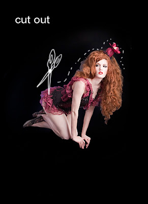
Next I took a large, soft brush (i'm partial to #65 personally) set to black at 100% and painted out everything but serena. I do like and want that blue spotlight behind her, but I'll be bringing that back in later. I work in many layers at a time, it's like taking 10 paintings and stacking them one on top of another, then connecting them all so I can paint in just the parts of each painting that I want to see and leave the rest. ;)
To cut Serena out I used my magic wand set to 10%. I don't use the magic wand for cutting out that often, it tends to leave things much too choppy for my taste and requires more touch up than I would like later on. For this piece however, with so much black, I felt it would be fine. I know I'm going to paint that blue light behind her back in later, so it will smooth out any rough edges and I'll retouch the rest by hand.
 The next step was to figure out what I wanted to do with her! In what scene would she look best and still work for the website? At first I thought of putting her on a thimble or pin cushion, but it just wasn't thrilling me. Often I'll cruise the stock sites and randomly enter in words or ideas that I have for an image in the search box and see what comes up. I find that sometimes just seeing a certain stock image will give me ideas and inspiration. In this case, I went to dreamstime, which is my favorite stock site and always my first go-to. They have a wide variety, but I am sad to say thier price per image has really gone up over the past couple years. It used to be $1 or $2 an image. Now I find it's often more like $4 or $5.
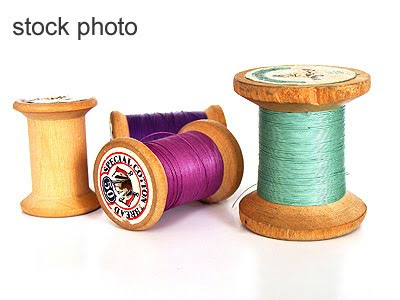 Once I found a few images I wanted to try I purchased and downloaded and tinkered to see which would look best. I ended up with this one because I really liked the bright colored thread and that dent in the green spool wood fitted just perfectly where her hands needed to be. I ended up painting out that last spool, as you can see. It was making the image too long and too busy and was superfluous in my opinion. You can already see how that knee is going to give me a problem later on down the road due to how the black cloth had wrinkled up around her knee when she was posing. I'll get to that!
Also notice the slight white line around the spools as a result of cutting them off the white background. Since I'm dropping them onto a black background, it becomes even more noticeable. (When you see the larger piece, it becomes very evident. I know you can't see it too well here on the smaller version) To get rid of it, I pulled the image up super duper close and used a large soft brush at 100% set to blur, and went over all the edges by hand.
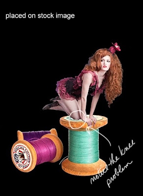 Now that the edges are all smoothed out (i did it to her hair ends, feet and legs as well) it's time to add some glow. The spools are still on thier own layer, so I went to Layer-> Layer Style -> Outer Glow. I double clicked directly on the color square to choose the color glow that I wanted. I chose blue because I knew it would match and continue the blue glow that I was going to paint back in for my background light. I could have changed the spotlight color if I wanted to, and I did think about it. But I felt that with already so much pink and red that I knew had to go into it, and the green and purple thread, the blue was a nice compliment color.
And for all you photoshop users out there - my settings for the outer glow were blend mode - screen, opacity 65%, spread 0, size 155px.
As you can see, I also smoothed out that knee a bit and used a layer mask to paint back in some of the blue spotlight behind her.
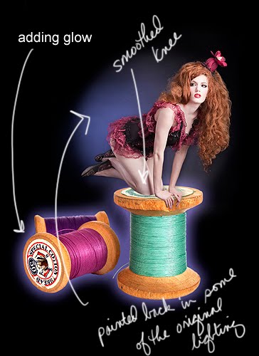
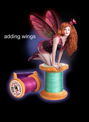
Time for wings! I bought these from the 2d department at Renderosity. I used the same technique as above for adding glow and chose a nice scarlet red. I also went in and popped the red in her hair and lips.
 Liquify, liquify and more liquify! Added the curly shoe tips, the pointy wing tips, and played around with her hair some more. I used a few hair shaped photoshop brushes with my clone tool, believe it or not. I put them on thier own layer, and actually cloned some of serena's actual hair but in the shape of the hair brush so it looked more natural, and placed them where I wanted them to go.
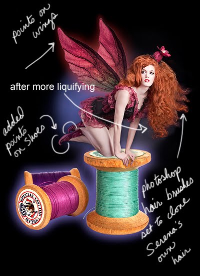 At this point I followed my mom's very sage advice about sleeping on it and looking at it again with fresh eyes in the morning. I can't tell you how many time that advice has saved me! Often times, you work on something for so long, that you just can't see it clearly anymore. At this point I had been working on it for about 7 hours and felt it was time for a much needed break.
When I got up the next morning and looked at it again, I knew something had to be done with that knee! I went through all my other images of the day and actually cut out a piece of her knee from another image and photoshopped it in with my soft brush at 12% opacity.
I also couldn't help but notice the blue circle was missing a piece where it should be between her hair and her wing, so I touched that up too. I created a new layer and added the sparkle with my favorite photoshop sparkle brushes. ( which I have had for years and can't remember where they came from or I would tell you. lol) I blurred them out with a slight touch of gaussian blur just to be a bit more realistic looking.
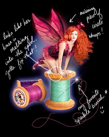
And lastly, I ran it through about 3 NIK filters with my ColorEfex pro. (i absolutely love this program and don't know how I ever got along without it!) And to make it even a little more illustrated looking, I added an extra layer and went to Filter -> Stylize -> Glowing Edges and ran it through that. I hit CTRL + I to the layer to change it from black to white (didn't want the image getting too dark) and then dropped the opacity of that layer to around 17% and blended it in. Popped the colors, painted back in the skin tones (don't want the skin tones to get too orange-ey) and viola! One made-to-order Scarlet Fairy! :)
Let's take a look at the original and finished pieces side-by-side:
Gee, I feel just like Bob Ross. lol Happy little faeries! ;)


No comments:
Post a Comment